Max Temperature
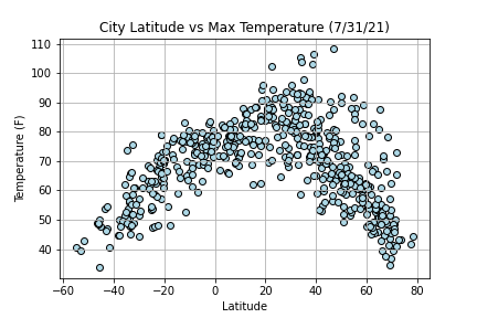
For world weather data, this plot is visually showing higher temperatures closer to the equator, and lower temperatures farther from the equator.
For world weather data, this plot is visually showing higher temperatures closer to the equator, and lower temperatures farther from the equator.